A gimmicky Normal PDF visual aid
Quite a lot of people have trouble visualising what’s going on when you look up p-values in a table of the normal CDF. I had an idea about how to explain a bit more dynamically using a bit of Craft Time inegnuity.
I made this sketch of the normal PDF in Asymptote and printed out two copies. I cut out the area under the curve of one of them, and glued its corners to those of the other one.
Now I can slide sheets of coloured paper between the two copies of the graph, showing visually the area under the curve up to a certain limit. Using a second colour allows me to show how the area between two values is calculated by subtracting the area corresponding to the lesser value from the area corresponding to the greater value.
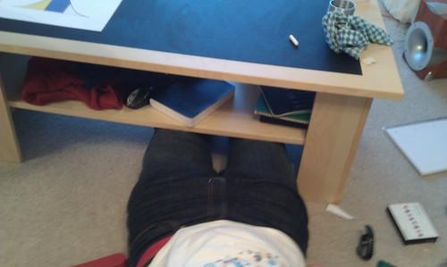
I mentioned in the video that it was awkward to film. This was because, in order not to get in the way of my camera, I had to shove my legs underneath the coffee table my blackboard is stuck to
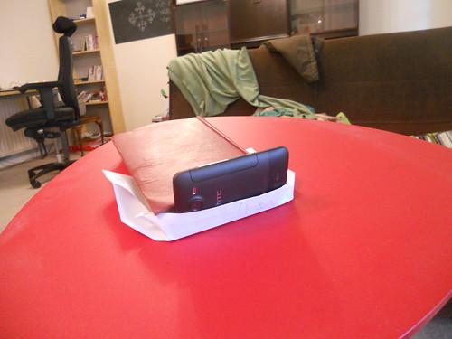
and twist my arm around the easel holding my very complicated camera stand:
What do you think? Was it a good way of demonstrating how values from the normal CDF correspond to probabilities?

